The Quanmain Collective
The Quanmain Collective was born from a deep conviction that stronger men create stronger families, stronger organizations, and stronger communities. We empower individuals and institutions through faith-rooted leadership training, organizational development, and personal growth programs that produce lasting impact.
services
Branding, Youtube Assets
client
The Quanmain Collective
timeline
3 – 4 Weeks
The Quanmain Collective approached Baldonki with a clear mission — build a unified, faith-driven brand identity that speaks powerfully to men, families, and leaders. Their vision centers on strengthening men so they can strengthen the world around them, and our goal was to translate that conviction into a visual and verbal identity that feels grounded, modern, and deeply purposeful.
We set out to craft a brand system that captures stability, transformation, and faith-guided leadership in a way that feels fresh, masculine, and unmistakably authentic.
logotype:

The Challenge:
The Quanmain Collective needed a brand identity strong enough to stand beside global leadership organizations, yet warm and relatable enough to speak directly to everyday men navigating real struggles.
They needed:
• A brand symbol that communicates stability, faith, and grounding
• Messaging that feels real, encouraging, and uncompromising
• A masculine yet approachable visual world
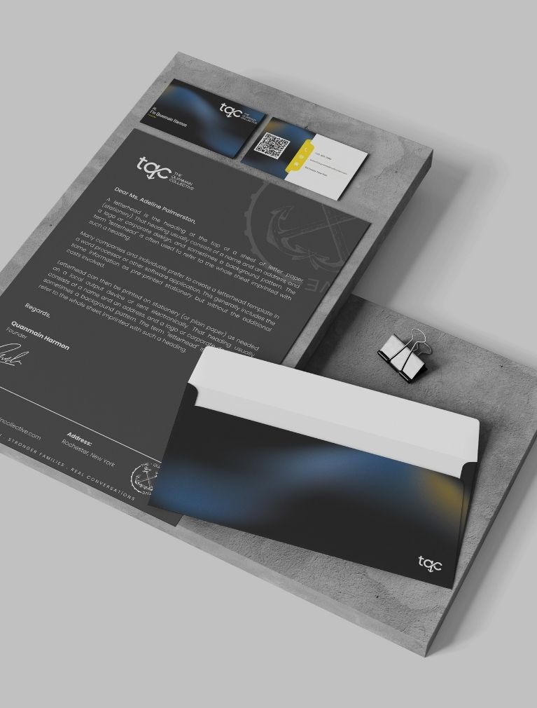
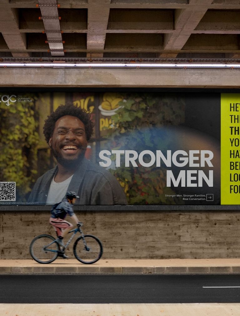
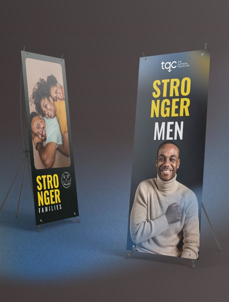
• A versatile design system for social media, coaching programs, events, merchandise, and digital content
• A voice that blends faith, authenticity, and leadership in one coherent tone
The challenge was to balance professionalism with vulnerability, creating a brand that calls men higher without losing compassion.

Our Approach:
The anchor emerged as the core symbol, representing stability, grounding, hope, and resilience.
From this foundation, we built a visual and verbal identity anchored in:
• Symbolism of the anchor — stability, grounding, spiritual foundation
• Masculine color stories — navy, black, olive, burnt orange, and gold accents
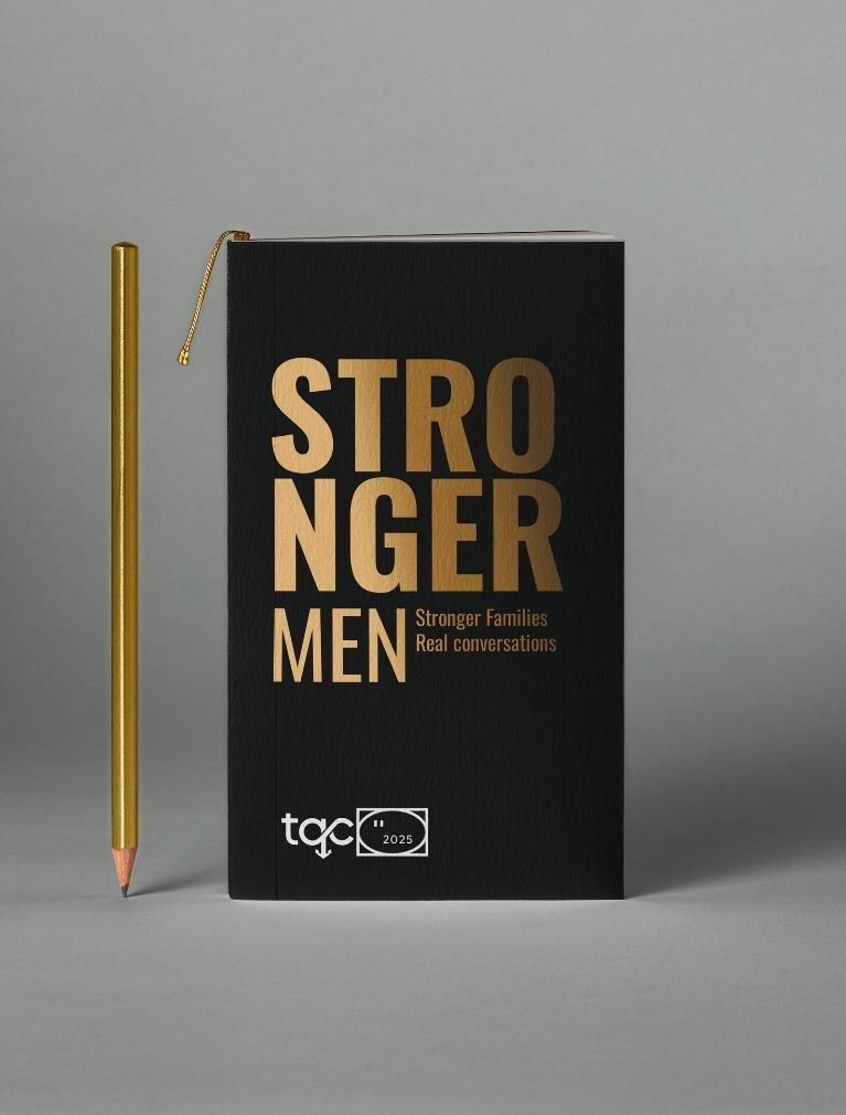
• Modern typography — structured, bold headers with clean, accessible body fonts
• Messaging rooted in authenticity and faith
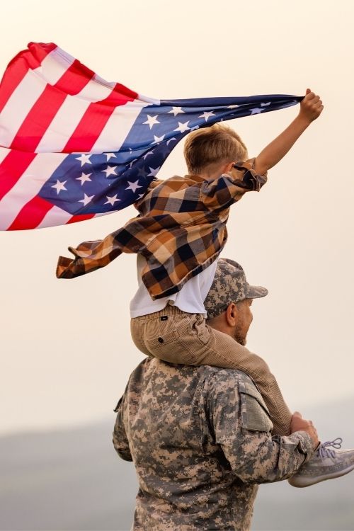
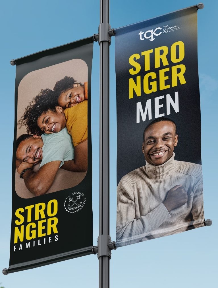
• Cinematic imagery capturing emotion, leadership, family, and brotherhood
Every design decision was crafted to embody the journey TQC stands for: from challenge to clarity, from struggle to strength.
logo variations

Our Solution:
Brand Identity System
• A custom “tqc” logotype integrating an anchor symbol for grounding and stability
• A heritage-style seal featuring crossed anchors representing unity, resilience, and collective strength
• A masculine and expressive color palette: Midnight Black, Deep Navy, Royal Gold, Burnt Orange, Olive Green
• Structured typography (Oswald + Poppins + Playfair) creating impact, clarity, and warmth
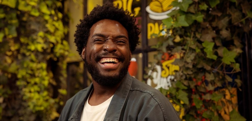
• Photography direction centered on leadership moments, family connections, and real emotion
• Cinematic videography guidelines for future content and campaigns
clear spacing

deliverables:
Brand Impact:
The new identity positioned The Quanmain Collective as a confident, structured, and faith-rooted movement with a clear leadership voice.
The brand now communicates:
• A powerful emotional connection with men seeking clarity, healing, and purpose
• A cohesive visual language ready for online teaching, retreats, events, and resource development
• Stronger credibility for partnerships with churches, schools, and organizations
• A recognizable anchor-driven symbolism that carries weight, meaning, and trust
The project reframed TQC as more than a leadership organization — it became a transformational community built on faith, strength, and authenticity.
Quanmain
Founder, TQC
More projects
GospelTube.tv
The One Apparel
Asa Africa
let work together
Elevate your brand with innovative ideas—contact our creative team today to turn your vision into reality.
